Last summer, we finished up a project that was supposed to take 8 weeks and took a year and a half.
I told myself that I should just live and enjoy the new parts of the house but of course I jumped straight into planning the next thing. The next thing was getting the bathroom that lived in my head out of my head and into real life. And it actually happened.
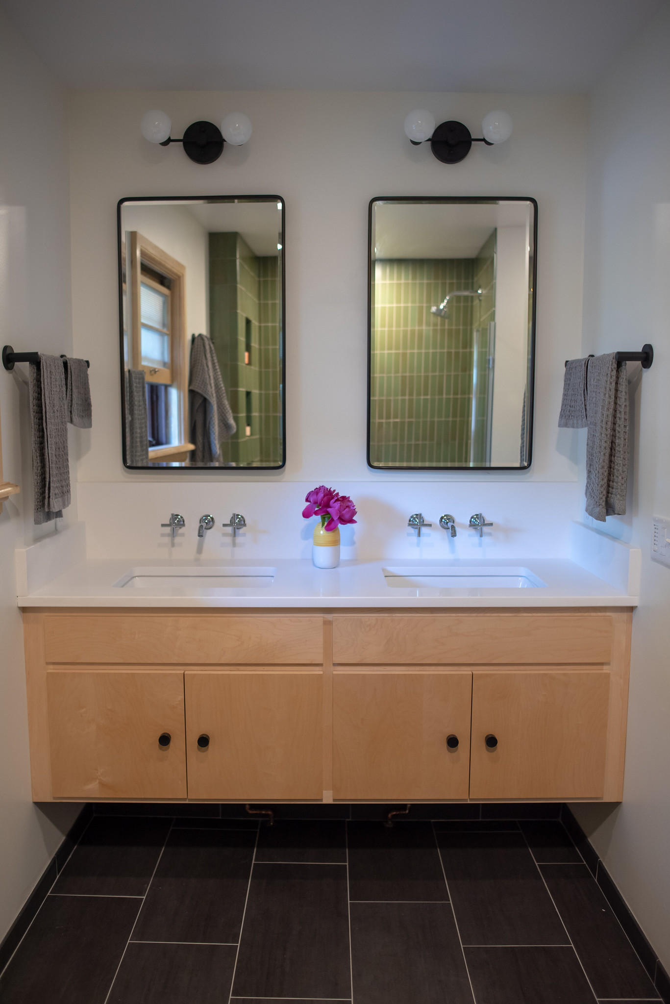
First of all, we didn’t rush into things — it took probably a year of slow planning to find the pieces, work with the contractor on floor plans and design, and to get this thing right. And I can say now that the tedious cycle was worth it. The bathroom feels like a spa. Which is a lot to say when considering that previously it looked like a yellow and black madhouse.

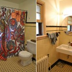
I am mad at myself for only snapping photos of the before when all of our stuff was cleared out because honestly, with nothing it in it had some fun art deco vibes. But as soon as you put anything in a yellow and black bathroom that isn’t black, it looks awful. So yeah — here are some photos the contractor snapped. I’m honestly embarrassed looking at them. But hashtag real life, amirite?

Other than the desire to kill the yellow and black, we also wanted to make the bathroom significantly more functional. You see, every morning Jason, Theo and I shared that one tiny floating sink. We spat toothpaste over each other’s heads and constantly had to ask someone to move. We had ample storage — which may seem nice, but actually led us to accumulate piles and piles of garbage (aka 100+ bottles of Marriott travel sized lotions stolen from our combined 12 years on the road) — and no place to put a single thing that we were currently using, like a toothbrush or shampoo bottle. It was obnoxious — we’d store stuff on the windowsill or back of the toilet or cover the little space we had on the sink with crap until someone inevitably knocked into it and it all came crashing down.
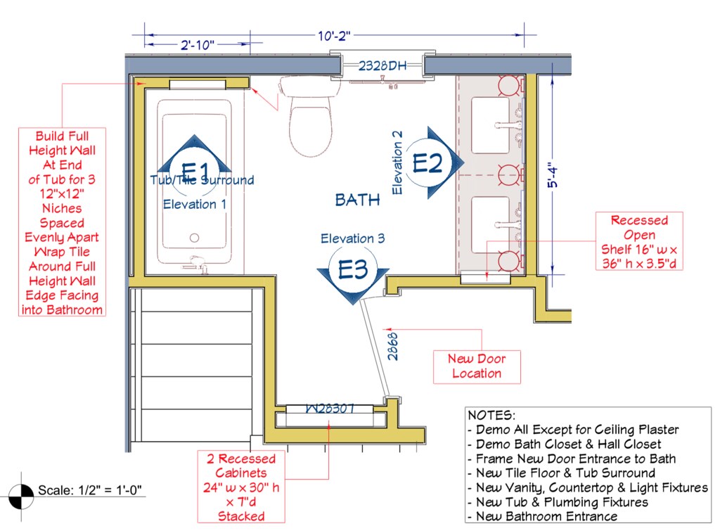
So yeah — we desperately wanted double sinks and we were willing to give up closets just to get it. Here’s a view of the floor plan before:

And after:
Once we had a feel for the layout, I started saving every picture of a bathroom on the internet that I came across that caught my eye. After I’d collected about 100, I started to pull out the themes I saw between the pictures I’d saved. One thing was clear: the vertical stacked tile in blues and greens definitely spoke to me (Exhibit A). As did this varied tone of tile — there was something so interesting but subtle about it (Exhibit B). We found the tile we wanted from Heath Ceramics.


I really wanted to avoid shower caddies and things stacked up on the ledge, so we opted for niches for storage.

Our old bathroom’s cross fixtures in the bathtub was something I loved, and I wanted to preserve that. When I found this updated equivalent it was a no brainer, and we took the theme to the sinks as well.

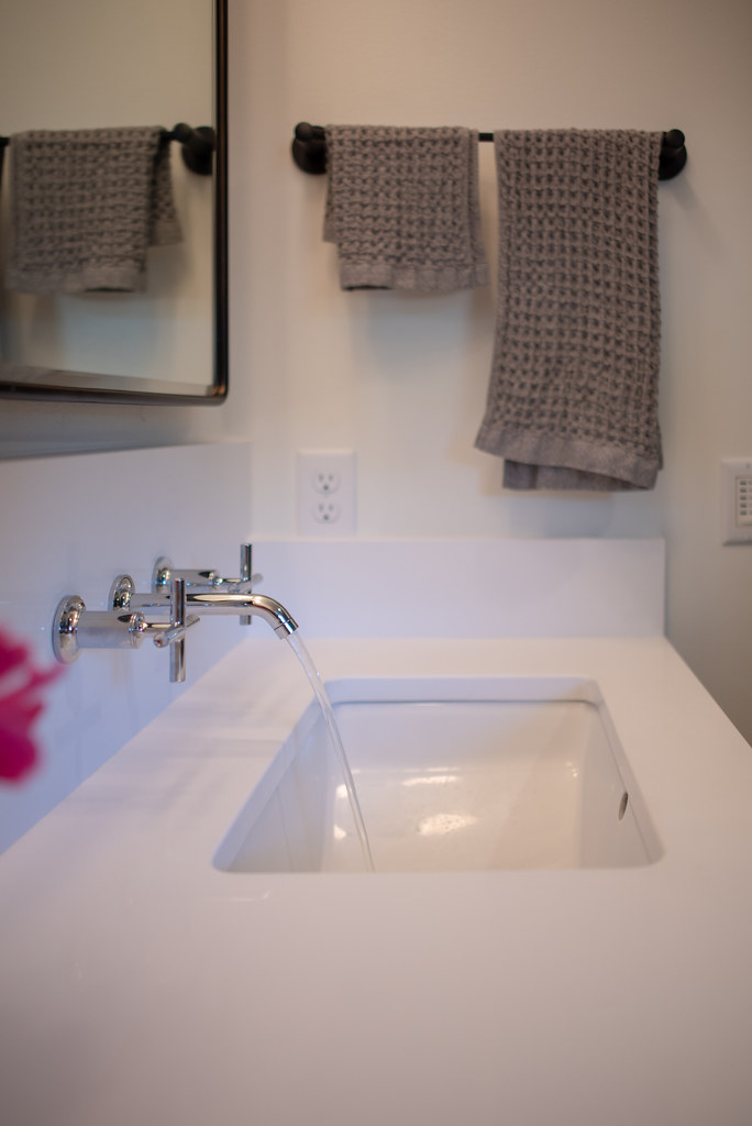
When it came to the vanity, we knew we needed to preserve some storage there (we were, after all, eliminating two closets) but we also knew that we wanted the radiator to be underneath the sinks rather than taking up a sizable amount of floorspace. I found a lot of light wood inspiration that felt really good with the green tones we chose for the tile.
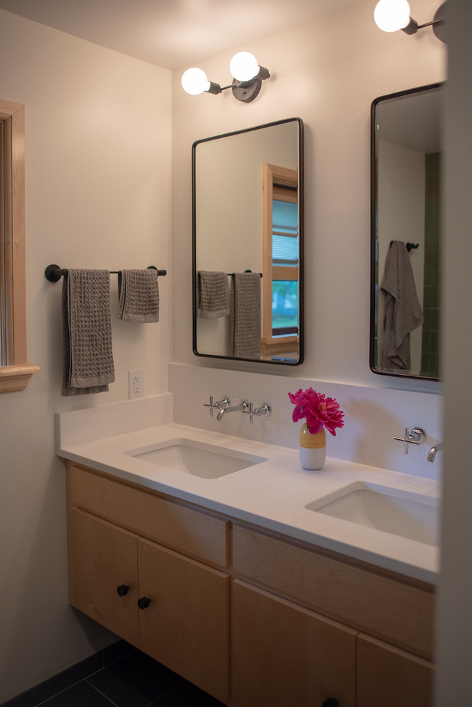
So, we floated the vanity (and put the radiator underneath) and added storage with built in mirrors. Plus the countertop space. Having a place to put a thing without it falling into the sink feels so luxurious!
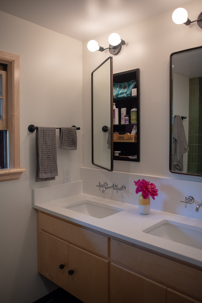
And since we had a little extra space, we tucked another cabinet behind the new door. It gives us just enough space to store the things we need and not enough space to accumulate a bunch of junk.

The rest of the details just kind of came together. We had the main things picked and just ticked off the next thing off the list every weekend. Until we got down to the last details — the hardware. And then construction began.

I’ll tell you that the living through the construction is never fun — especially when that means that you live without a shower for 8 weeks (whole project took 10). We stayed at a friend’s house for the first two so we missed the worst of the demo, but then we lived in total construction zone for the rest of the time, relying on the kindness of our friends to let us use their showers at random times of the day and week. It was not ideal, but it got the job done, and I owe everyone a lot of treats for their generosity and open doorness. And of course, it wouldn’t be fair to finish without mentioning our contractor Frey Construction, who we’ve worked with before, and who I have nothing but kind words to say about. If you are local to Madison, I wouldn’t choose any one else.
And in case you’re interested in the details, here’s a source list:
- Floor tile |
- Bathtub (in white) | Kohler
- Shower tile (M27 Olive #3, 2×6) | Heath Ceramics
- Shower head (in polished chrome) | Kohler
- Shower handle, faucet, and converter (in polished chrome) | Kohler
- Shower door | Kalia
- Maple vanity | Custom made by Cabinetry Plus
- Quartz countertop | Custom made by Counterspace
- Vanity knobs | Schoolhouse Electric
- Yellow vase | IKEA (no longer available)
- Sink fixtures in polished chrome | Kohler
- Mirrors in antique bronze | Pottery Barn
- Light fixtures in all matte black | MODCREATIONStudio
- Towel rods | Schoolhouse Electric
- Towel hooks | Schoolhouse Electric
- Toilet paper holder | Schoolhouse Electric
- Toilet | Kohler
- Towels (Cinder Grey) | Onsen





floating sinks are The. Worst.
writes scottEspecially in the only full bathroom. But yes, PREACH.
writes VickyThis is probably the most “it actually makes sense” kind of post I’ve seen on on this subject. Best part… I didn’t have to go digging through some weird web design to find it. Awesome! Please keep posting new material! https://www.longviewbathroomremodeling.com/
writes Paul HendersonI love those green tiles!! Were they expensive? They have such an elegant and modern look and feel.
writes BenThey’re from Heath (https://www.heathceramics.com/) so they’re on the more expensive side but totally worth it in my opinion!
writes Vicky CassidyKudos on transforming your vision into a stunning reality with your dream bathroom! The careful planning, stylish choices, and collaboration with Frey Construction have truly paid off, creating a spa-like oasis that is both luxurious and functional.
writes Maria